Most marketplaces have the same core functionality
Rarely is a marketplace so unique that the core functionality, such as having a checkout or cart needs to be designed from the ground up.
It’s a waste of time to design these features from scratch
Spending time on (re)designing interactions that others have already all but perfected is nothing short of a waste of time.
Not only is it a waste of time, but after all the effort, it’s more than likely that you’d not come up with something new and revolutionary, just worse.
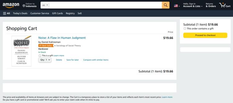
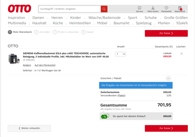
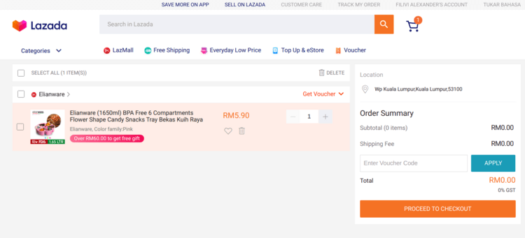
Take a look at the cart
Amazon’s looks like this:

Otto’s like this:

And Lazada’s like this:

The difference is only in the details. Depending on which demographic you ask, one of these design will be most familiar and therefore the other two will be confusing.
It’s not central to your business
It is almost certainly not critical to your business to have a brand new innovative checkout process.
In fact, implementing something unfamiliar would be detrimental because you would have to educate users from scratch. On the other hand, using established practices familiar to users removes some of the cognitive load.
You might also feel that this is cheap and that you wouldn’t be innovating. But the reality is that there are lots of other things to innovate. There’s little point in innovating on the small things, versus putting your efforts into innovating the processes that your business was created for.
Besides, why would you take risk and put in effort on something that’s entirely tangential?
So, look at market leaders and copy them
The role models that you choose should be market leaders. What you copy will be familiar to more of your potential userbase then if you copied a smaller competitor.
They must have a similar demographic. You can’t copy Airbnb if you’re running a B2B industrial supplies marketplace.
You can pick different role models for different parts of the system. For instance, we looked at Lazada – the leading ecommerce platform in South-East – when it came to checkout but Grab – Uber – when designing loyalty.
And copy the most generic parts, do not try to duplicate entirely. That gets you 80% of the feature.
Then customize for your niche
The remaining 20% is what you’ll get to (and have to) iterate on.
After you’re done with the generic v1, work starts on v2 where you’ll build the customizations specific to your industry and user personas.
For instance, we had to add an indicator of whether the suppliers’ minimum order value has been met. We also had to add the storefront name field in the address because company names often don’t match restaurant names exactly.
But make sure to copy the right thing and not duplicate it entirely
There are two potential pitfalls when doing this.
The first is copying something that looks similar but isn’t equivalent. You can copy something that doesn’t have the equivalent users – different demographics, industries, etc. It can also be because you’re copying something that doesn’t have the same purpose. For instance, copying Uber’s messaging feature, which has two participants, but yours has to have many.
The second is taking the copying too far. The objective is to quickly build the first version. It’s not to copy as thoroughly as possible.
For instance, the role model might show related products. If you do not have a recommendation engine, it’s wiser to either skip it entirely or make a very simple version of it. It’s likely not worth the effort to invest in building a fully-fledged system just for this.
Similarly, do not copy something which needs an entire process behind it. For instance, don’t copy the “Pick up” delivery option if you aren’t able to support the process for it yet.
But isn’t copying unethical?
I think it depends on the extent.
Copying the layout of the cart from Amazon, in my opinion, is not only fine but prudent.
But signing up for a competitor and copying their entire process isn’t.
As with most things related to ethics, it’s difficult to quantify and you’ll know it when you see it. Here are some examples, in my opinion.
Amazon copied the logic behind asking for app reviews from Barnes and Noble’s. That is entirely kosher. (I cannot seem to find the source for this, but it was a fascinating story.)
Facebook copied Stories. That’s borderline. It was a key feature, but not the entirety of the app.
In the world of F1, Racing Point infamously copied the entire Mercedes car. In my opinion, that’s going too far.
And what happened to Eco is positively entirely too far.
I think the stage the company is in also matters. If you’re copying a startup that’s in your niche, not only would that be unethical, but you’ve got bigger problems.